Brand Experiences
Inspiration4
The Challenge
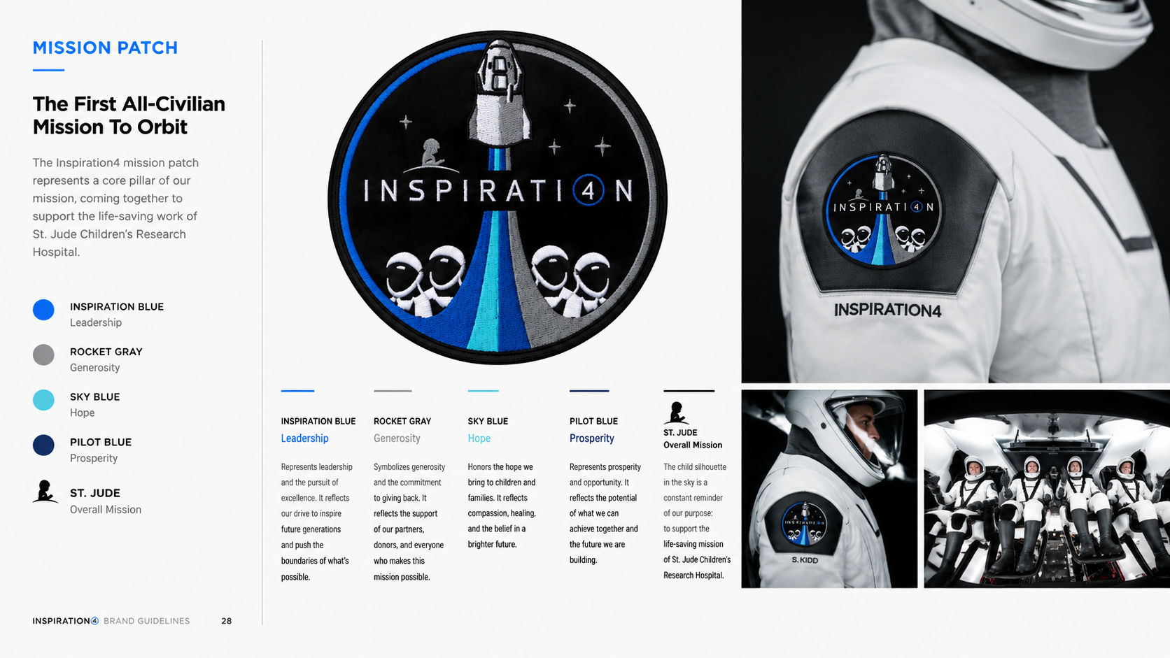
Shift4 had acquired Shift4Shop and wanted to introduce both brands on the world's biggest stage. Together with SpaceX, the mission would become the first all-civilian flight to orbit Earth while inspiring a nationwide fundraising campaign for St. Jude Children's Research Hospital.
The Ask
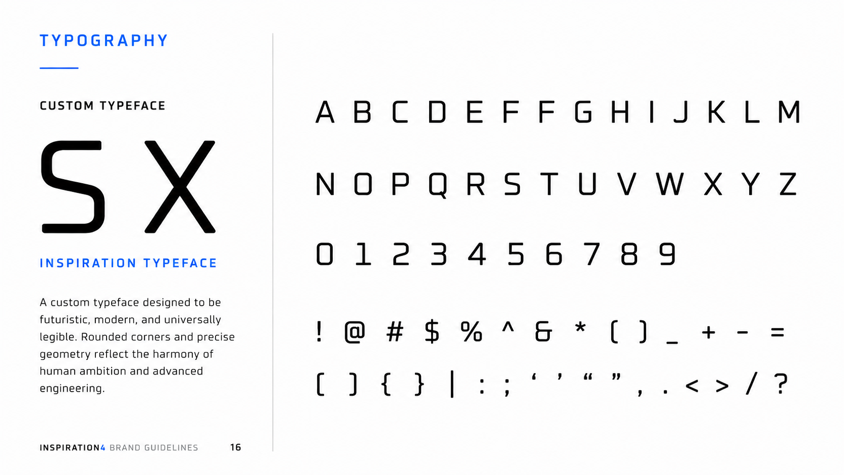
Create a unifying brand identity for Inspiration4 that could live across every touchpoint—from the mission patch and custom typography to the website, social campaign, merchandise, and launch communications—while capturing the optimism and ambition of the historic mission.
My Solution
I developed the visual identity and design system for Inspiration4, built around four aspirational pillars—Hope, Prosperity, Generosity, and Leadership—that guided the mission and represented each crew member. The system included a custom wordmark, mission patch, bespoke typeface, color palette, digital experiences, social content, and branded collateral for both Inspiration4 and Shift4. The campaign helped raise nearly $250 million for St. Jude Children's Research Hospital while introducing one of the most inspiring commercial space missions ever launched.
#BrandIdentity #Typography #LogoDesign #SpaceX #CreativeDirection #DesignSystems #Packaging #DigitalDesign
Let Jack Be Jack
The Problem
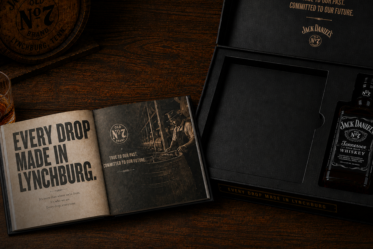
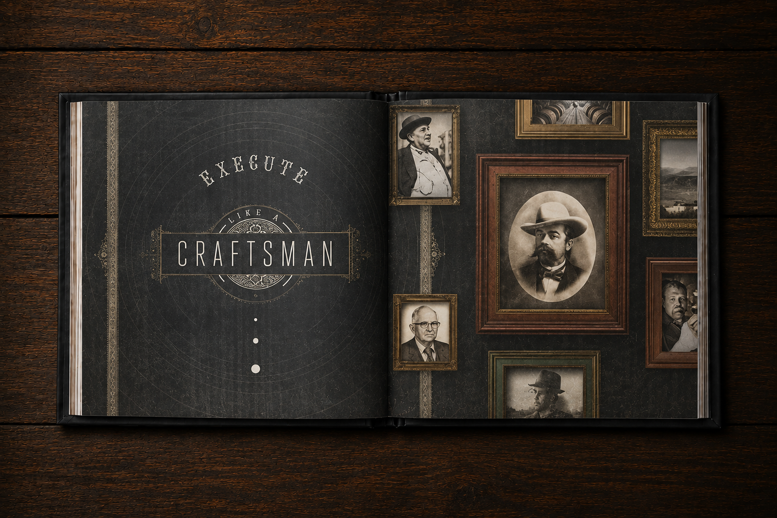
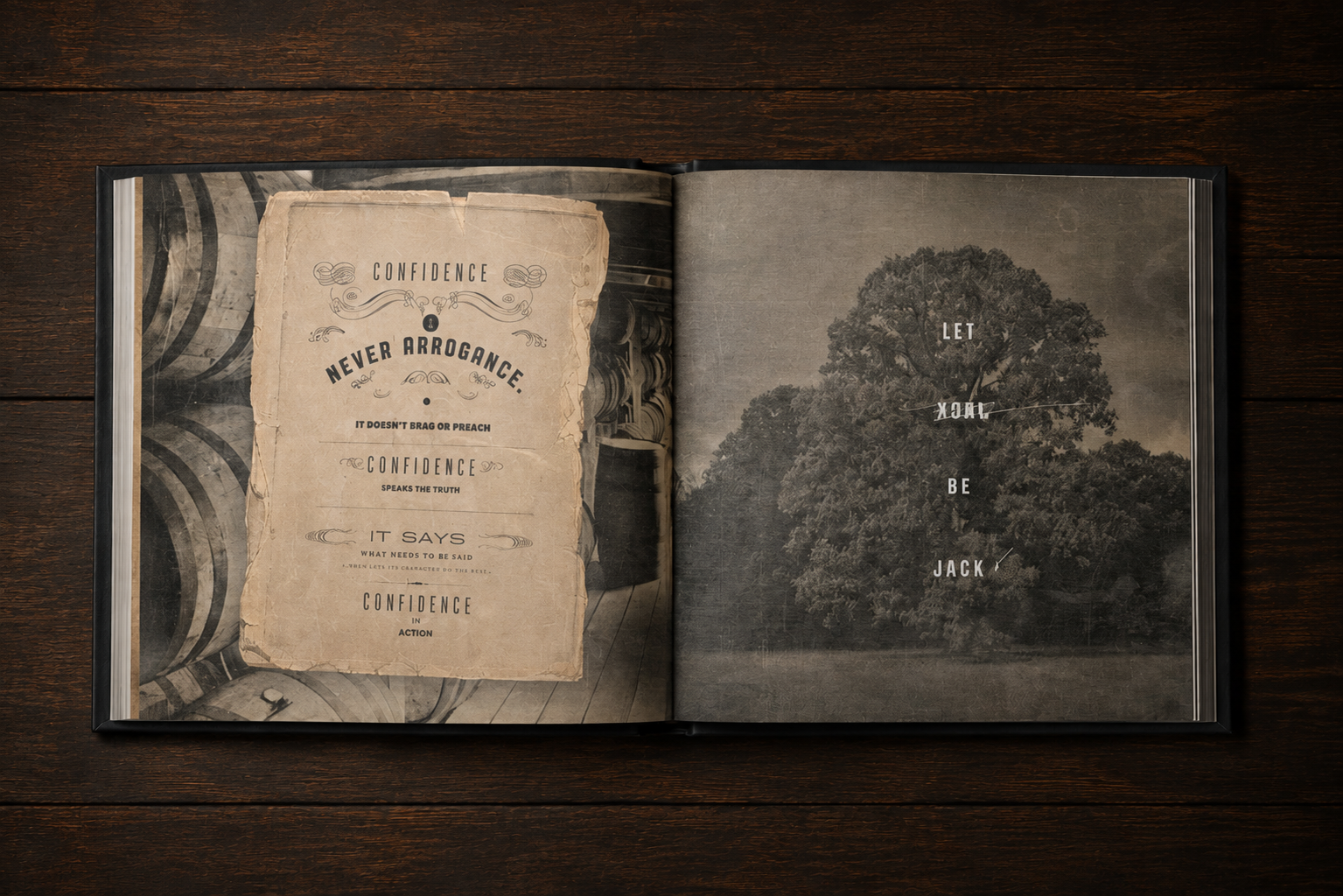
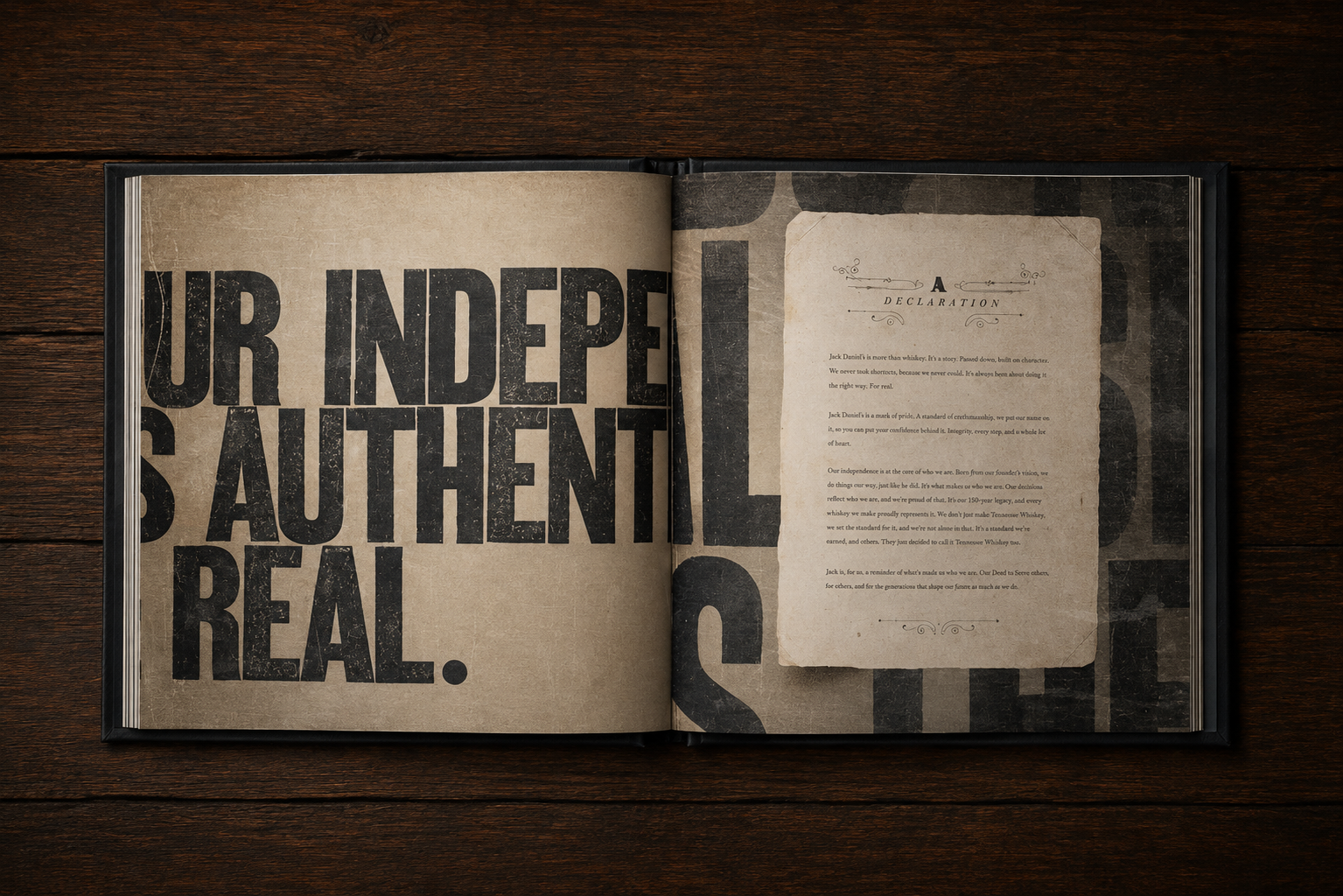
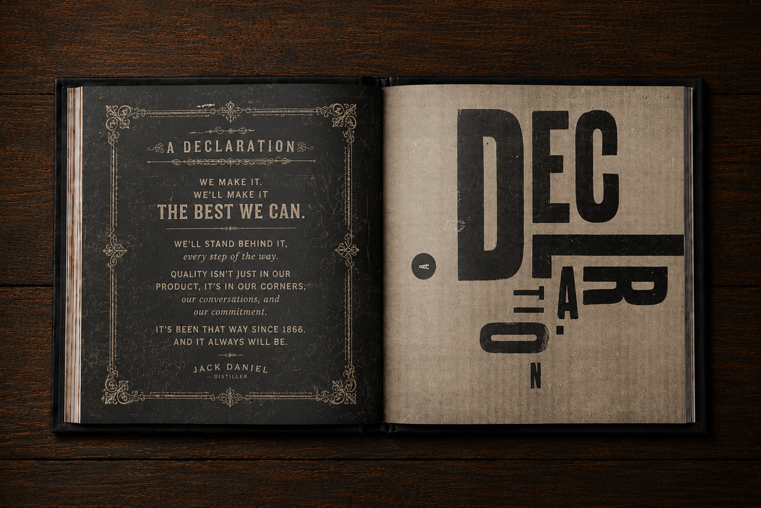
Arnold Worldwide approached IAAH to create a premium brand book that captured the authenticity of Jack Daniel's while establishing a timeless editorial system for agency partners, internal teams, and future brand stewards.
The Ask
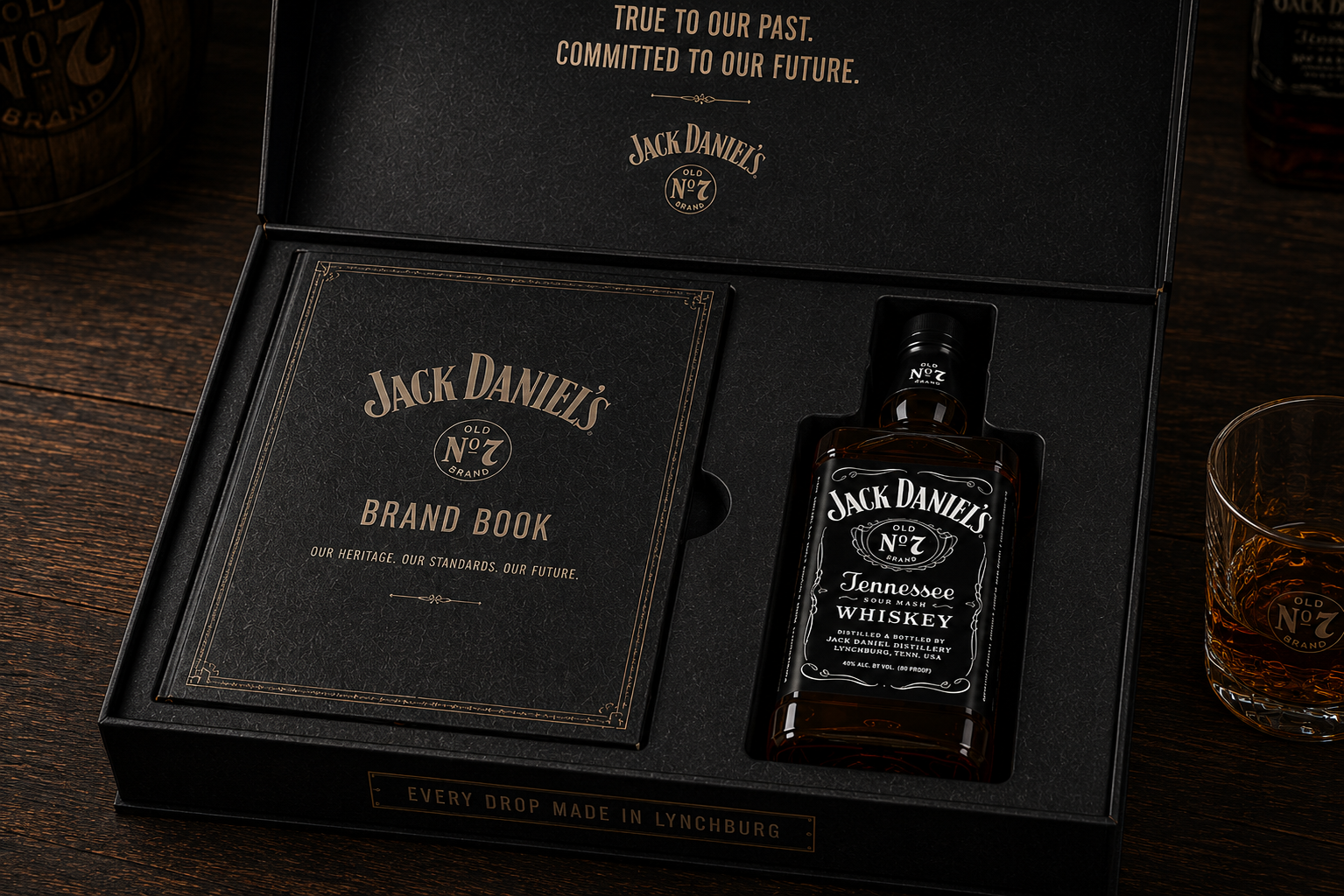
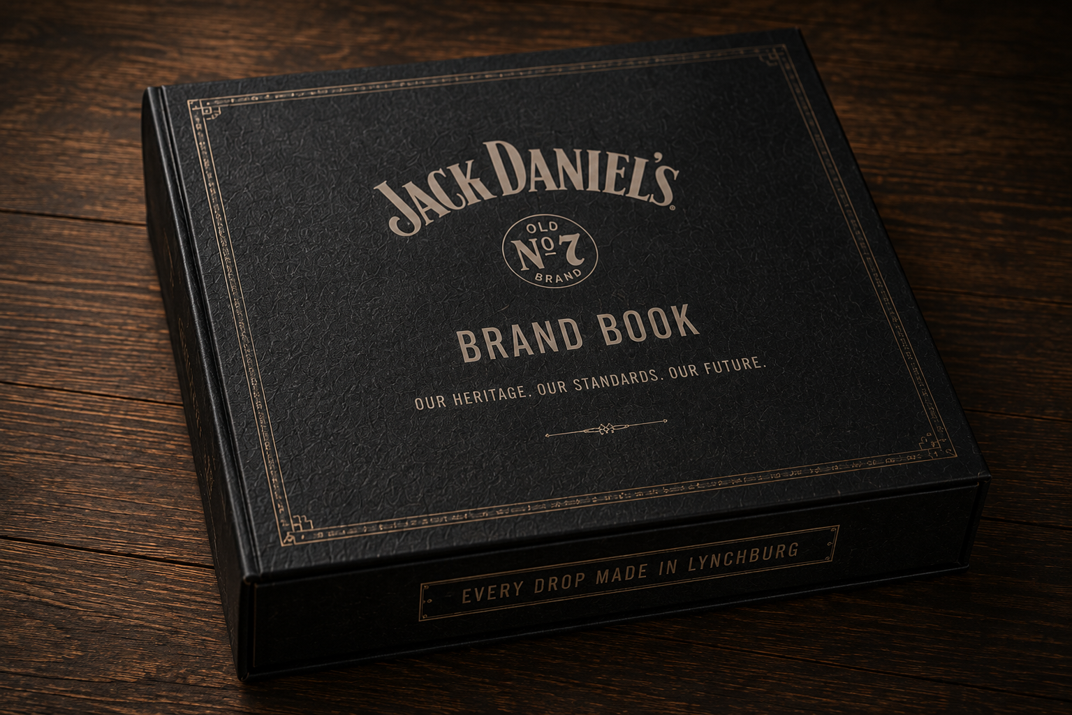
Design a hardcover brand book and presentation box that celebrated more than 150 years of craftsmanship through typography, photography, materials, and storytelling.
My Solution
Working alongside IAAH owner Ness Higson, I created a custom editorial system inspired by woodblock lettering, vintage distillery ephemera, and traditional letterpress printing. The experience extended beyond the book into a premium presentation box that houses both the brand book and an iconic bottle of Old No. 7, transforming the identity guidelines into a collectible brand experience that feels as authentic as the whiskey itself.
#BrandIdentity #EditorialDesign #PackagingDesign #Typography #CreativeDirection #PrintDesign
KnD Brand Refresh
The Problem
After more than 30 years in business, Kay n' Dave's had built a loyal following, but its identity no longer reflected the quality of its food. The brand felt dated and inconsistent across every touchpoint, from signage and menus to packaging, uniforms, and social media.
The Ask
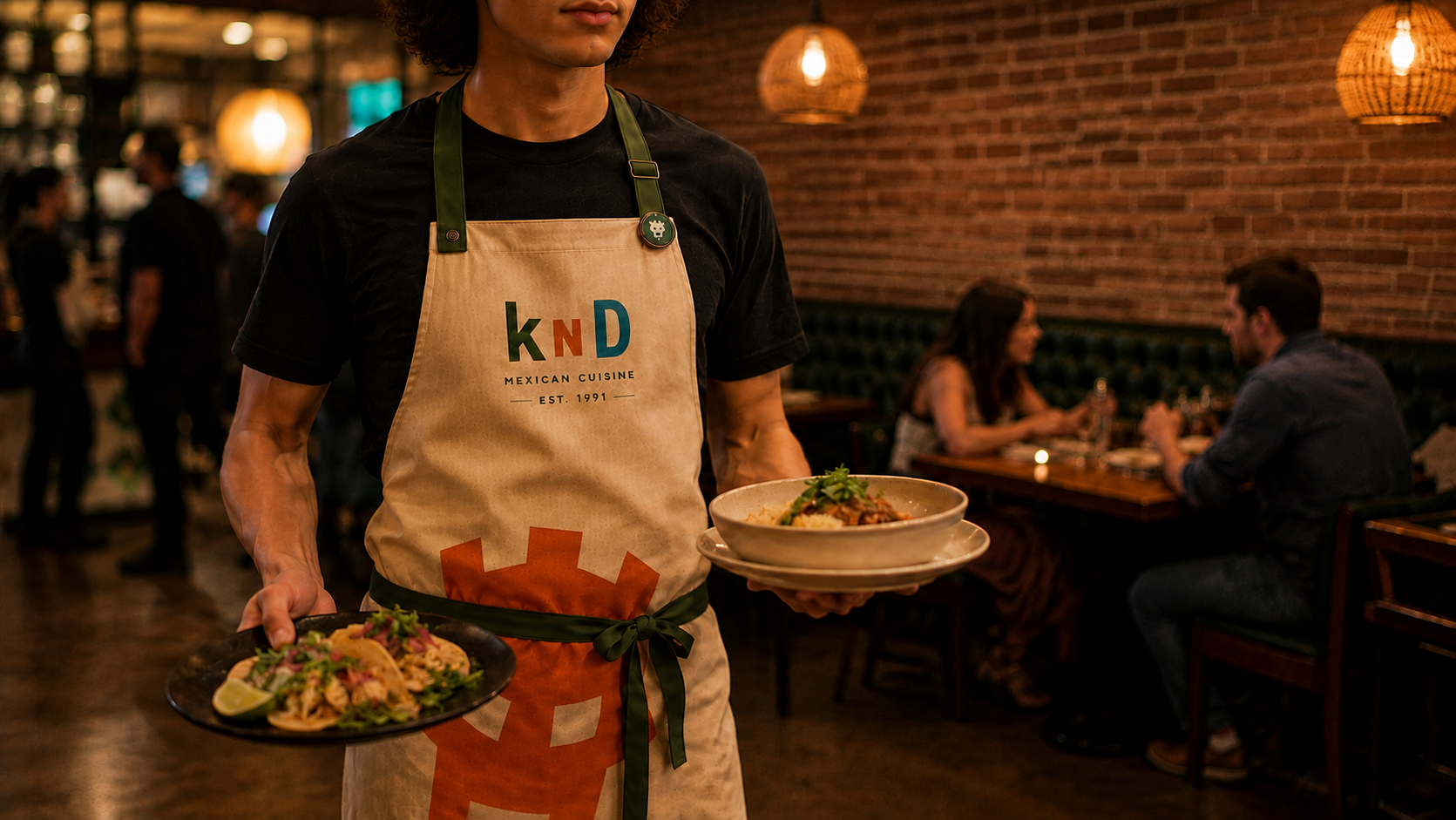
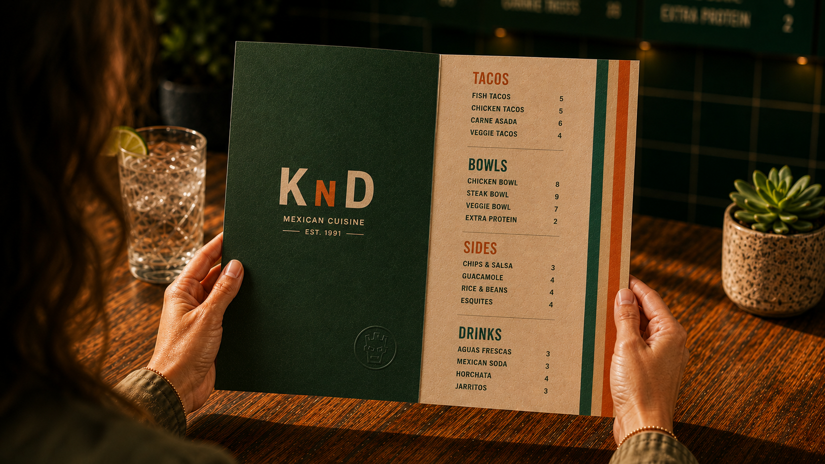
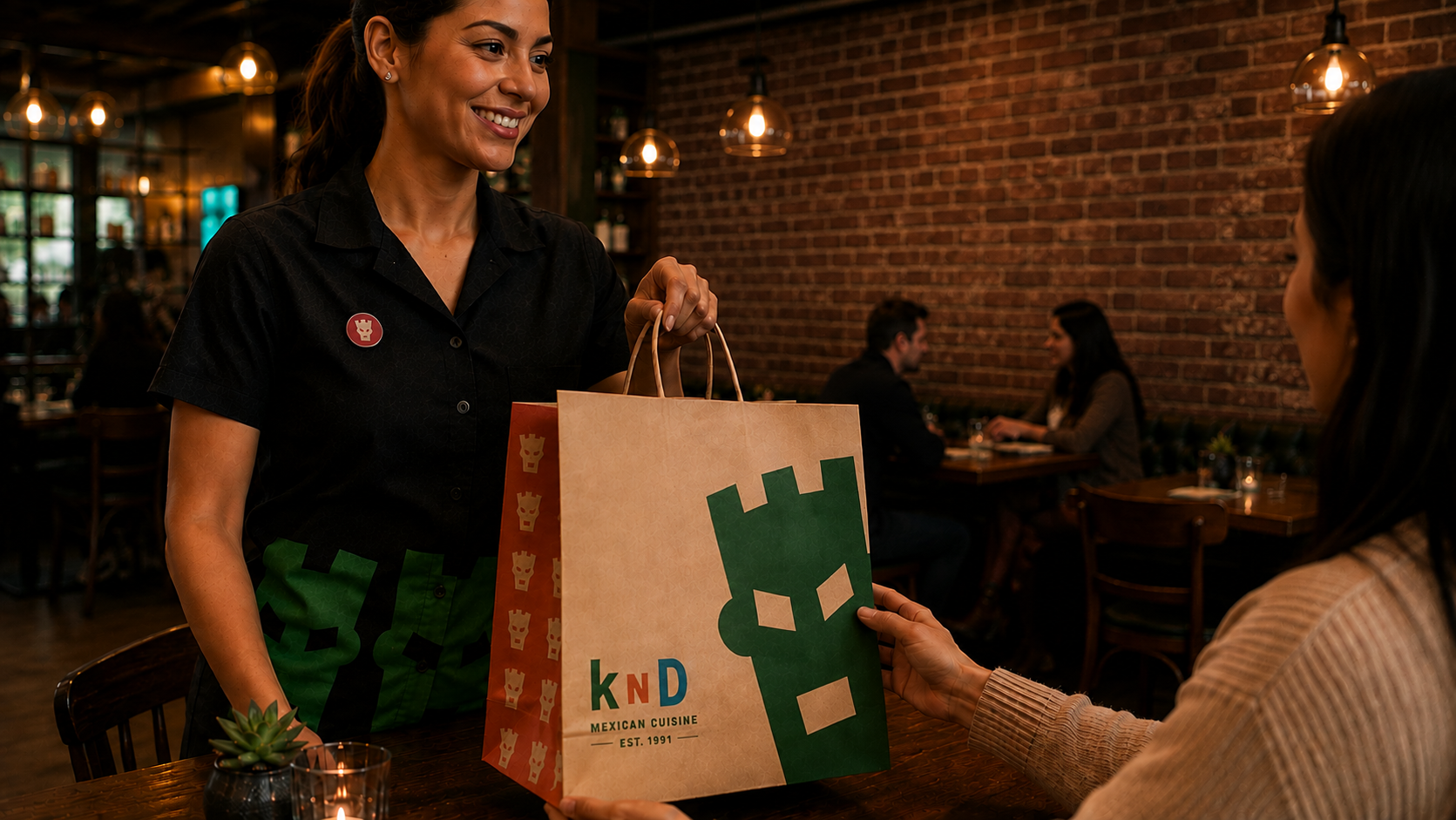
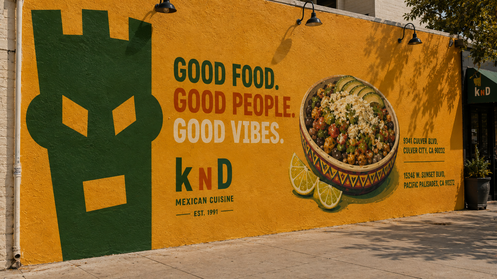
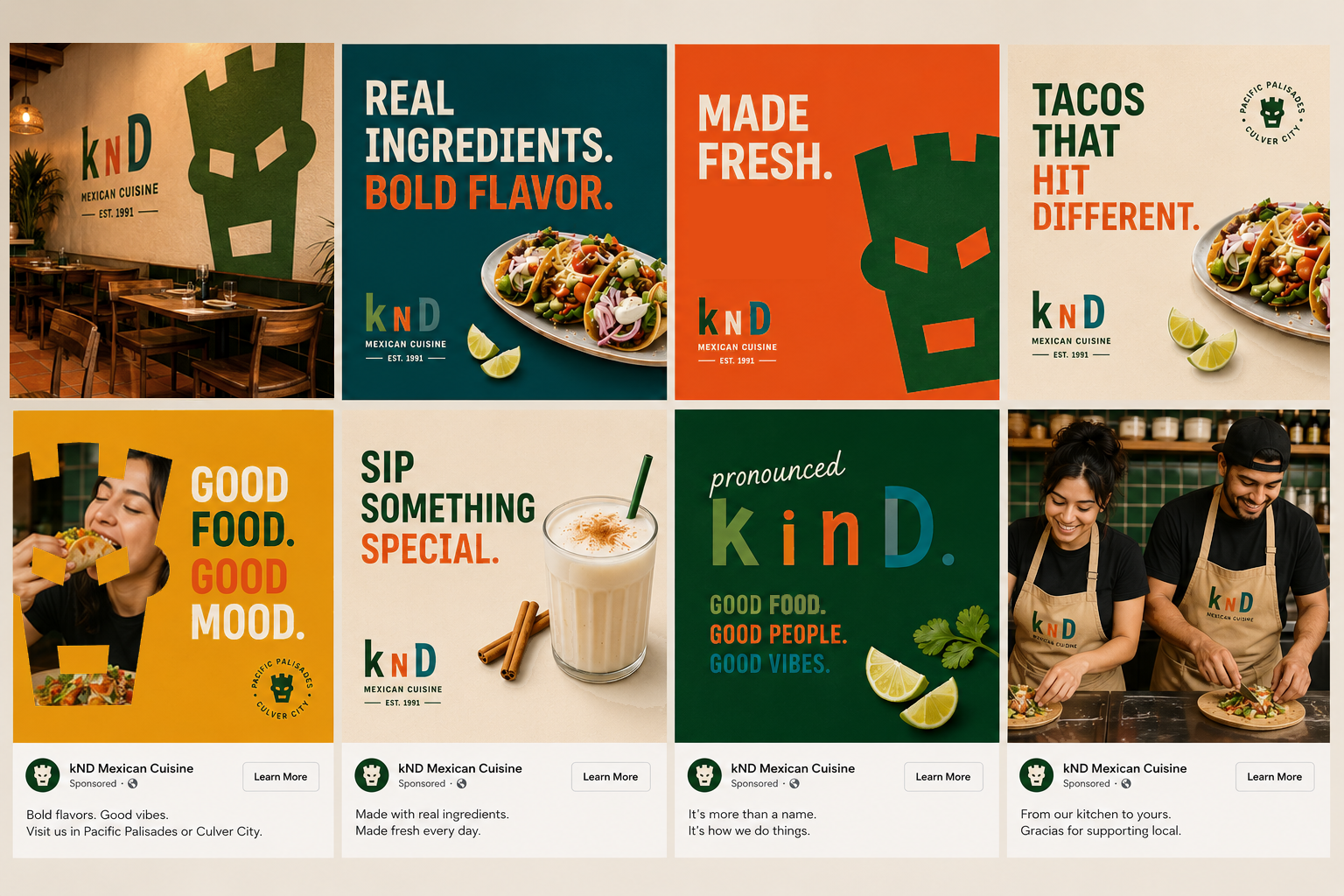
Refresh the brand from the ground up by renaming the restaurant KnD (pronounced Kind) and creating a cohesive identity system that could live across the restaurant, packaging, signage, merchandise, digital, and social media.
My Solution
I transformed Kay n' Dave's into KnD, a modern identity built around the idea that great food begins with kindness. A custom mask icon, vibrant color palette, and bold typography created a flexible brand system that extends across menus, packaging, uniforms, murals, environmental graphics, social campaigns, and restaurant interiors. The result is a cohesive, contemporary brand that feels approachable, memorable, and distinctly Southern California.
#BrandIdentity #RestaurantBranding #PackagingDesign #EnvironmentalDesign #Typography #CreativeDirection #LogoDesign
Match.com Green Flags campaign
The Problem
Match is one of the most recognized names in dating, but recognition alone doesn't change perception. For years, online dating has been dominated by conversations around red flags, ghosting, and swipe fatigue. The challenge wasn't introducing Match to people—it was giving them a new reason to believe in it.
The Ask
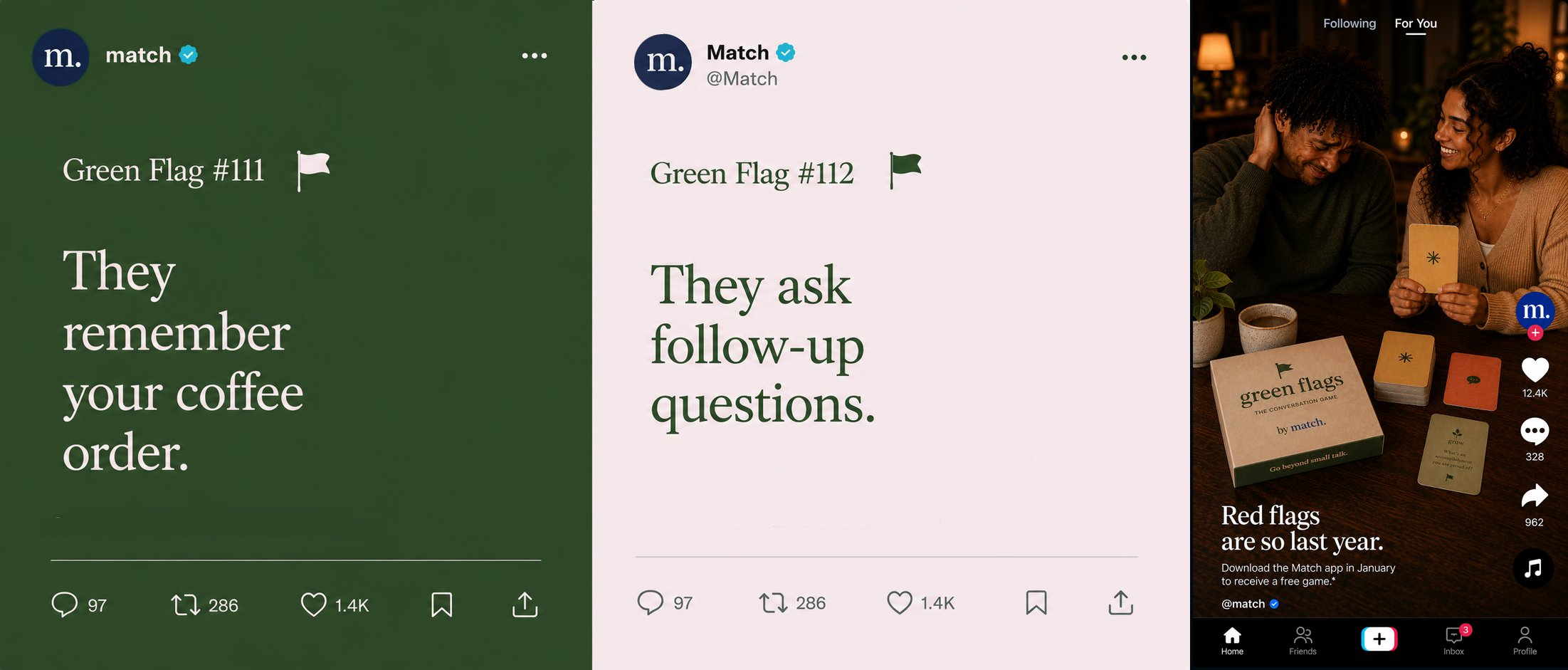
Create a campaign that shifts the conversation from what's wrong with dating to what's worth celebrating. The idea needed to live across social media while extending beyond the screen into a memorable branded experience that people would actually want to keep.
My Solution
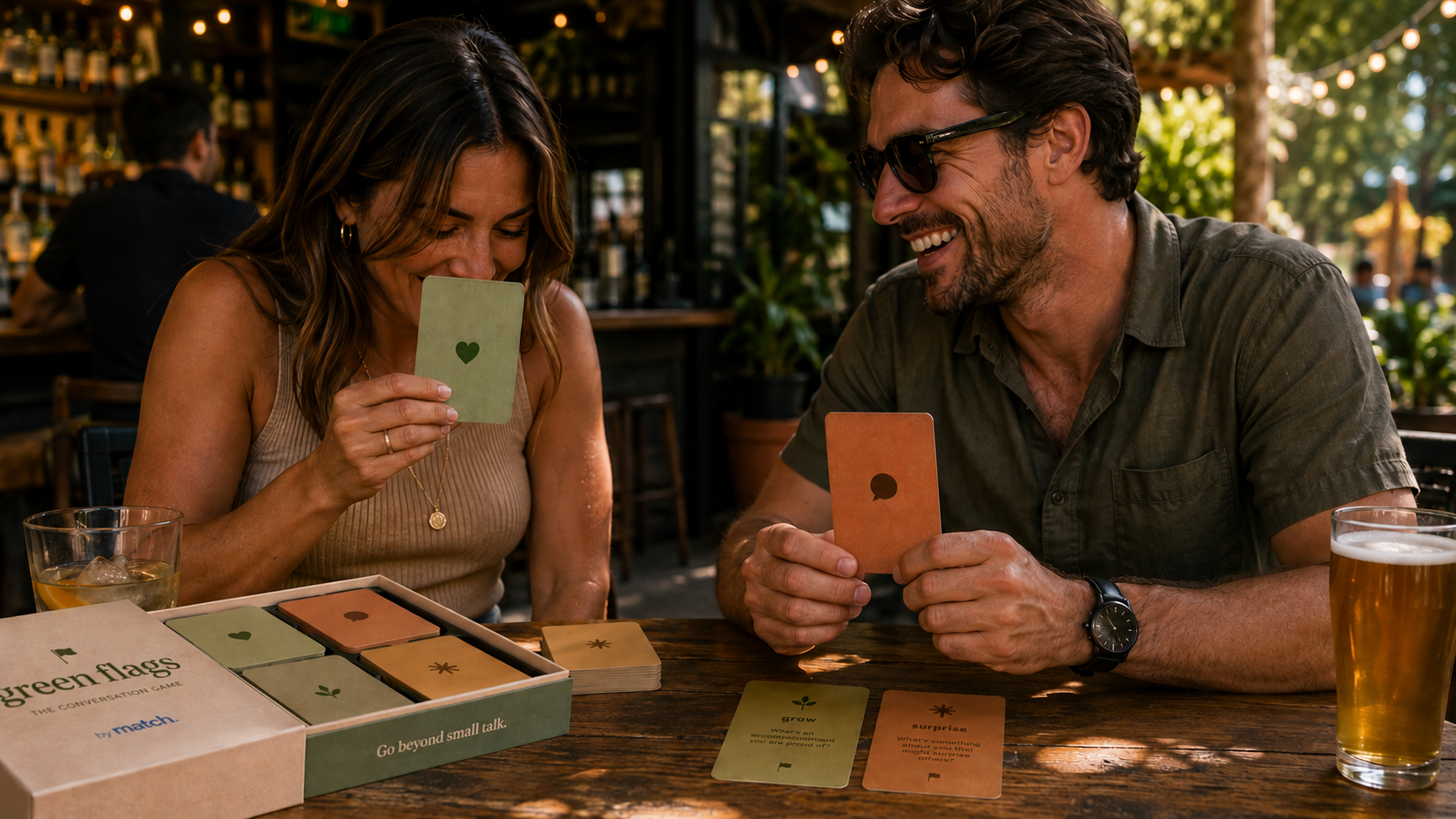
Green Flags transforms positive relationship behavior into a cultural conversation. Through a social campaign built around relatable "green flag" moments, Match reframes emotional maturity as something aspirational, shareable, and worth celebrating.
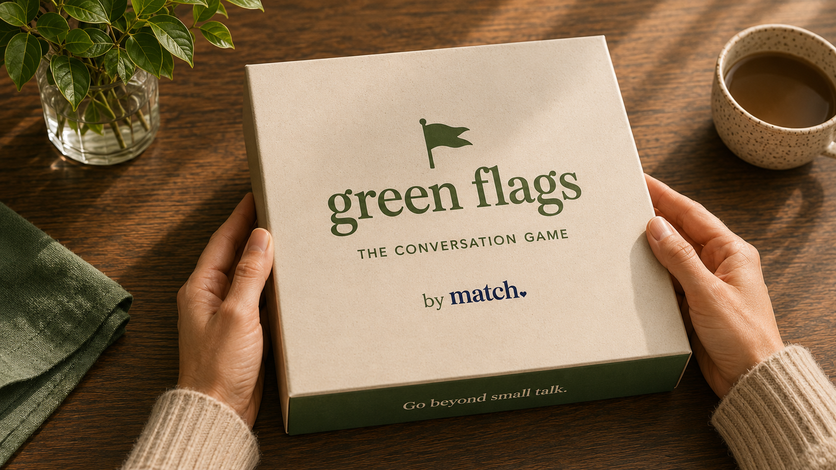
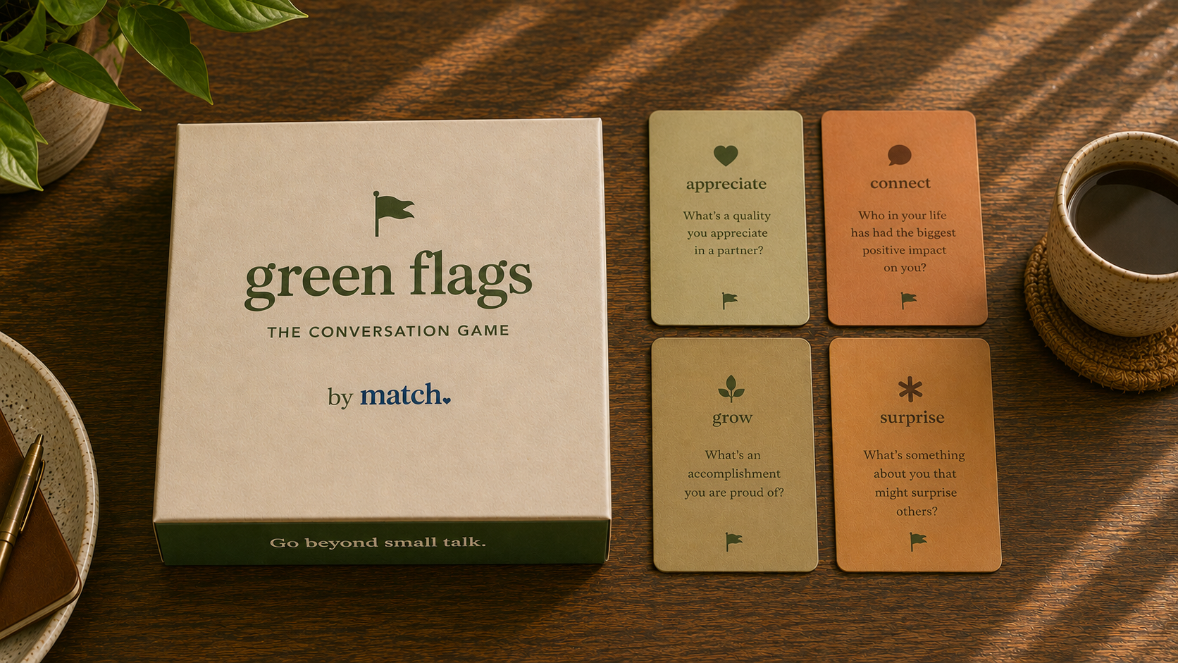
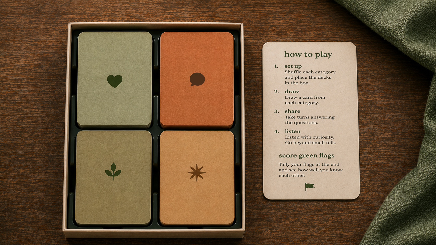
To bring the idea into the real world, I designed a premium conversation card game that encourages meaningful conversations offline. At a time when consumers are craving tactile experiences and physical products from brands, the game turns the campaign into something people can gather around, play, gift, and display—extending Match beyond the app and into everyday relationships.
The result is a campaign that doesn't just advertise better conversations—it creates them.
#CreativeDirection #BrandCampaign #SocialMedia #ExperientialDesign #PackagingDesign #ProductDesign #BrandStrategy #ArtDirection
Logo + Brand Direction




Turner Classic Movies
Women Make Film – Toolkit
I delivered tune ins, a toolkit and a promo to the network Turner Classic Movies.
The promo kicked off a three month festival celebrating 100 women filmmakers. The festival was also encapsulated in a Mark Cousins’ epic documentary. Tilda Swinton, Jane Fonda, Thandie Newton and many other key figures discuss the themes and work of these celebrated women in film that are often overlooked, and largely unknown. For 13 decades and on all six continents, thousands of women have been directing film, and TCM celebrated these accomplishments
for an entire month.
ADC Young Guns 9
Branding, winner’s book, award and marketing materials for The Art Director’s Club NY Young Guns 9 Competition. The work was featured in Communication Arts Typography Annual.
Role: Designer
Agency: IAAH


Discover NAD
The online science journal DiscoverNAD wanted to feel modern and approachable with their new logo. We incorporated the complex and abbreviated molecule into the lettering to create a custom mark.
